
Standard, Deep Matte, or Fine Art Printing: Which Is Right for Your Portraits?
When it comes to turning your photos into physical keepsakes, not all prints are created equal. Below is a clear comparison between the common options — Standard Paper

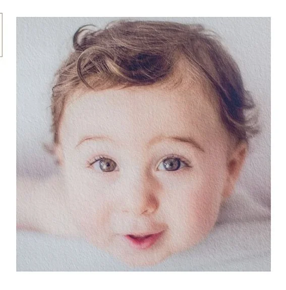
Surface and look: Standard paper typically refers to a traditional photographic archival quality paper with a semi glossy finish. It yields natural color reproduction and soft-to-moderate contrast.
Texture and feel: Feels like ordinary photo paper — smooth (gloss)— and is pleasant to handle for albums and wall prints.
Color and contrast: Delivers accurate, true-to-life colors and natural skin tones. Contrast is balanced and predictable, making it ideal for portraits and general photography.
Use cases: Portraits, family prints, albums, enlargements where a classic photographic look and faithful skin-tone rendering are priorities.
Durability: High-quality standard photographic papers are archival, resistant to fading when properly displayed and stored.
What is Deep Matte Printing?

Surface: Smooth, lustreless finish with no shine. It feels soft to the touch and reduces glare.
Color/Tone: Produces rich, vibrant color and pure whites. Excellent at rendering detailed images and strong black-and-white contrast.
Feel: Hefty, premium-feeling paper that’s smudge-resistant and durable for handling.
Best For: Albums, photo books, everyday prints, detailed shots, and situations where you want color pop without glare.
Cost: More affordable than fine art; great for multiple prints, albums, and family-handout copies.
What is Fine Art (Giclée) Printing?
Surface: Light, watercolor-like texture that adds depth and a tactile, dimensional quality to the image.
Color/Tone: Captures subtle tonal shifts and nuances better than standard papers, giving prints a more three-dimensional, painterly appearance.
Production: Printed with large-format inkjet (Giclée) printers using archival inks and papers designed to last decades.
Best For: Displaying photographic art, gallery-style portraits, or any image where you want a classic, museum-like presentation and long-term archival quality.
Cost: Significantly more expensive due to specialty materials, archival inks, and slower, more careful printing processes.
How to Choose — Practical Tips
For albums, everyday family photos, and prints you’ll handle frequently: choose Standard or Deep Matte. It gives bold color, resists glare, and holds up well to repeated use.
For wall art, gallery pieces, heirloom portraits, or images where texture and subtle tonal depth matter: choose Fine Art. You’re paying for a tactile surface and archival quality that elevates the photo to an art object.
Consider size and volume: If you need many prints (e.g., multiple framed gifts or large family albums), Deep Matte and Standard provide excellent value. For a few standout pieces or limited-edition prints, Fine Art is worth the investment.
Look at the image itself: Highly detailed, high-contrast images often shine on Deep Matte. Portraits with soft skin tones, delicate highlights, or painterly composition frequently benefit from Fine Art texture.
#schexnayderphotography #sanantoniophotographer #sanantoniophotography #sanantoniohighschoolsenior #portraitphotography #printsforportraits #schexnayderandjamesweddingphotography #wallart